
Datamine Network Integrates Predictive Dashboard Trendlines
💡 AI Article Summary
Predictive Trendline Visualizations Integrated into Datamine Dashboard
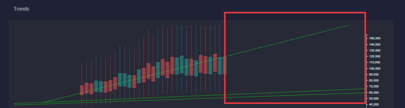
The Datamine Network has deployed a key UI/UX update to its decentralized analytics dashboard, enabling predictive trendlines to be projected into the future. This customized addition provides users with deeper foresight into tokenomics data, bypassing the standard limitations found in off-the-shelf charting libraries.
By projecting historical data forward, validators and participants can better analyze ecosystem trajectories, such as the deflationary velocity of FLUX or the decreasing inflation milestones of LOCK.
Aligning Charts with On-Chain Metrics
The next development phase focuses on calibrating the dashboard's data bars to mirror live on-chain metrics accurately. These UI/UX improvements aim to make the complex interactions of the Datamine smart contracts—including token burning, minting yields, and liquidity dynamics—even more transparent and accessible to the community. The refined visual interface is expected to go live for public testing within a few days.
Hey guys,
Was going to do the bar value mappings today but instead spent time working on a few pieces of UI/UX.
The most important of which is the trendlines are now finally drawn into the future!
This was super tricky to do and I am glad it's finally done as this is basically the core functionality that I couldn't find in charting libraries.
Tomorrow I plan to fix up the bars to properly reflect the on-chain data. Things are starting to come together, a couple more days and you will be able to play around with this. 🔥
Frequently Asked Questions
What is the latest charting update on the Datamine Network dashboard?
The latest update introduces custom-drawn predictive trendlines that project token data into the future, helping users visualize long-term ecosystem growth and deflationary trends.
Why did Datamine build a custom charting solution instead of using standard libraries?
Standard charting libraries lack the native functionality to project predictive trendlines into the future for complex, decentralized monetary metrics. Custom development was required to support Datamine's specific on-chain analytics.
When will the updated charts be fully functional for users?
Following the trendline implementation, the developer is refining the data bars to precisely reflect live on-chain data. The finalized interactive charts are scheduled to be available for public testing within a couple of days.
 · hodlforjesus · #dev-updates