Datamine Network Develops New On-Chain Trend Visualization
💡 AI Article Summary
The Datamine Network dashboard is expanding its real-time analytics suite with a new trends visualization tool. Designed to make complex on-chain metrics more accessible, this upcoming feature will track structural market movements across the ecosystem's native tokens, including DAM, FLUX, ArbiFLUX, and LOCK.
Visualizing On-Chain Market Dynamics
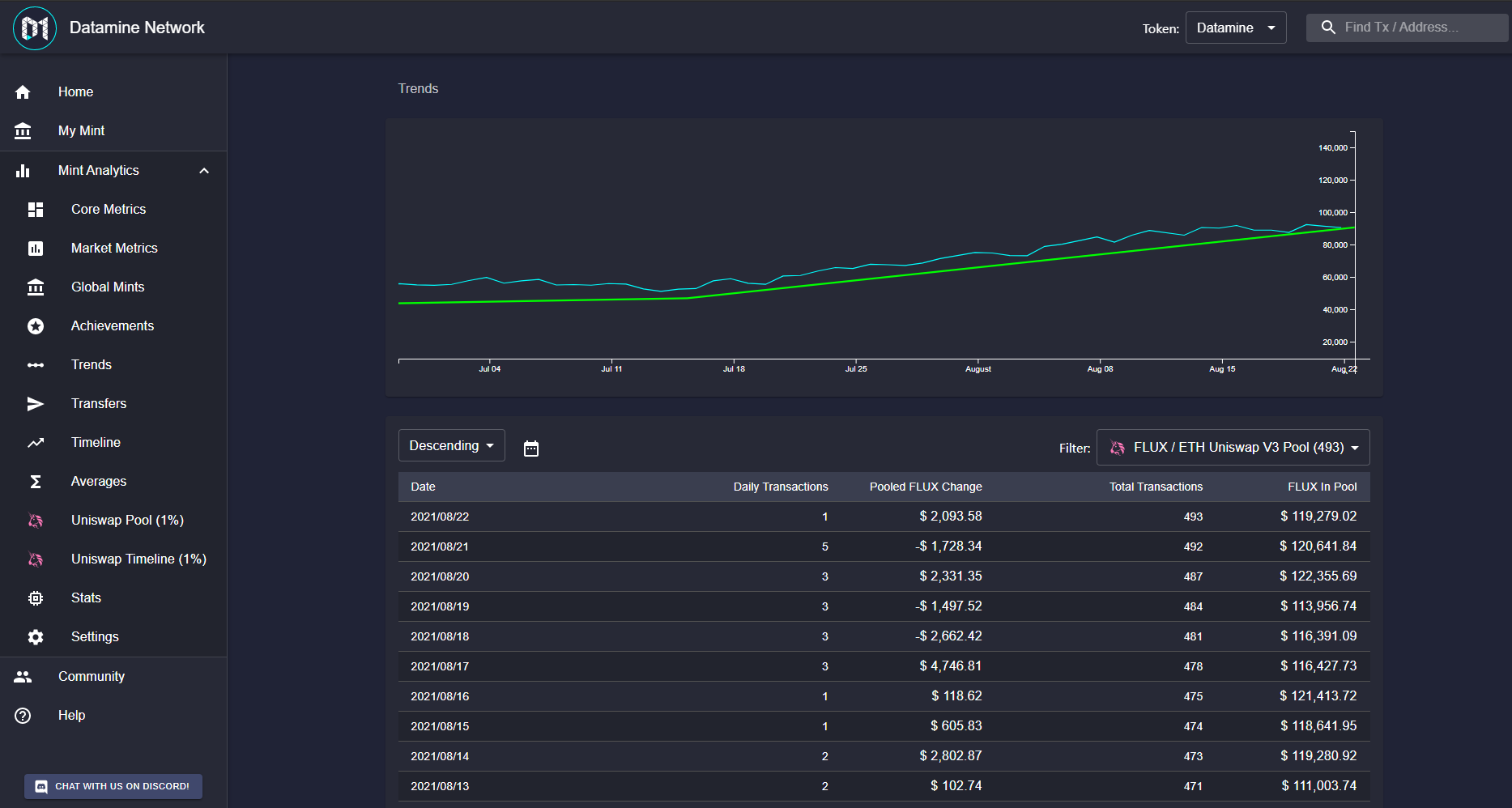
Initial development builds of the trend tool focus on mapping directional market data. By analyzing key indicators such as token burning rates, available liquidity, and supply inflation, the interface helps users identify emerging patterns. While the current prototype displays only positive uptrends, future iterations will map both upward and downward market shifts to provide a complete, balanced picture of economic velocity.
Transforming Lines into Bar Charts
To improve user experience and eliminate ambiguity, the visualization format is transitioning from standard line plots to structured bar charts. This modification will clearly demonstrate how trends are established, their overall strength, and how long they remain active. By refining these charts, Datamine continues to provide transparent, real-time analytics for liquidity providers and validators tracking deflationary mechanisms.
Hey guys,
Wanted to show you an early view of the trends work in progress. Currently only the uptrends are visible and this is not the best demonstration of the technology.
We also need to convert these lines into a barchart otherwise it'll be very confusing how these trends are formed and how long they're active for.
I also picked a pretty bad data source to demonstrate with so I will have a better sample tomorrow with both uptrends and downtrends. 🔥
Frequently Asked Questions
What is the new trends feature on the Datamine dashboard?
It is a work-in-progress visualization tool designed to display on-chain trend data, tracking both positive and negative market shifts across the ecosystem.
Why is Datamine changing the trend lines to bar charts?
Bar charts will make it easier for users to understand how trends are formed and how long they remain active, preventing visual confusion compared to standard line plots.
What tokens are monitored within the Datamine Network?
The ecosystem consists of four decentralized utility tokens: DAM, FLUX, ArbiFLUX, and LOCK, which govern minting, stability, and liquidity.
 · hodlforjesus · #dev-updates