
Predictive Trend Analytics Added to Datamine FLUX APY
💡 AI Article Summary
Predictive Trends for FLUX APY
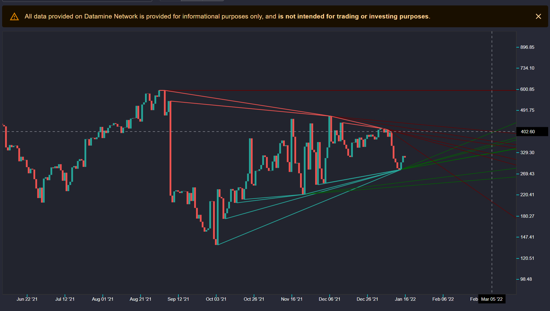
Datamine Network is rolling out predictive trend analytics for core ecosystem metrics. This update introduces historical data visualization, starting with FLUX APY trends calculated over more than one year of on-chain activity. This allows users to better analyze past performance and anticipate future ecosystem yield.
Forecasting Core On-Chain Metrics
By implementing these mathematical forecasting models, Datamine plans to expand predictive analysis to other critical metrics. Future additions will include FLUX Burn percentage, pool sizes, and yearly supply inflation. This algorithm will help users correlate multiple on-chain metrics, helping identify potential market support and resistance levels.
Next Steps and User Interface Updates
This feature is scheduled to launch early this week. While the initial focus remains on establishing the underlying math and data visualization for core metrics, subsequent updates will streamline navigation and improve the dashboard interface.
Hey guys not sure if you saw but I've applied trends to FLUX APY. This was a long term dream of mine when we started Datamine ecosystem to get trends and then start applying it to core metrics.
This gives us the power to forecast all important numbers, APY % is just the start. We'll add FLUX Burn %, pool size, inflation % etc.
Trend analytics algorithm will allow us to correlate trends across multiple core metrics and see where the market is heading / when to expect resistance and support. We'll need a lot more UX updates to make it a seamless experience but I want to get trends working for core metrics first, then we can worry about cleaning up navigation.
Planning to get APY % out on trends early this week so be sure to check it out (In the screenshot attached we're analyzing over 1 year of APY data) 🔥
Frequently Asked Questions
What is the new trend analytics feature on Datamine?
It is a predictive analysis tool integrated into the Datamine dashboard that visualizes historical data, starting with FLUX APY, to help users forecast key network metrics.
Which metrics will the trend algorithm analyze in the future?
In addition to FLUX APY, the network plans to introduce trends for FLUX Burn percentage, liquidity pool sizes, and yearly supply inflation.
How does this help Datamine validators and users?
By correlating multiple core on-chain metrics, users can analyze market trajectory, better anticipate yield changes, and locate potential economic support and resistance zones.
 · hodlforjesus · #dev-updates