
Datamine Upgrades Dashboard with New Custom SVG Illustrations
💡 AI Article Summary
Enhancing Visual Clarity for Decentralized Metrics
To further improve the user experience across our decentralized dashboard, we have integrated custom-designed SVG illustrations. This update is aimed at enhancing UI/UX readability, making it easier for users to navigate our multi-chain ecosystem and track the relationships between our core tokens: DAM, FLUX, ArbiFLUX, and LOCK.
Because the Datamine Network operates entirely via decentralized smart contracts without a central authority, our real-time dashboard serves as the primary gateway for users to monitor on-chain analytics. These new vector assets replace generic graphics with tailored visual cues designed specifically for our tokenomics and liquidity structures.
Streamlining Complex On-Chain Data
Visual clarity is highly critical when tracking key metrics such as market efficiency, burn percentages, and available liquidity. The new SVGs make it simpler for both manual users and node operators to quickly interpret complex data points, including:
- Ecosystem Flows: Streamlined visuals representing the locking and minting progression from Layer 1 to Layer 2.
- Burn Mechanics: Clearer graphics illustrating how burning LOCK or FLUX redirects value to support permanent, decentralized liquidity pools.
- GameFi Interfaces: Optimized visual elements within the HODL Clicker and Datamine Gems interfaces, ensuring validators can efficiently monitor and collect rewards in real-time.
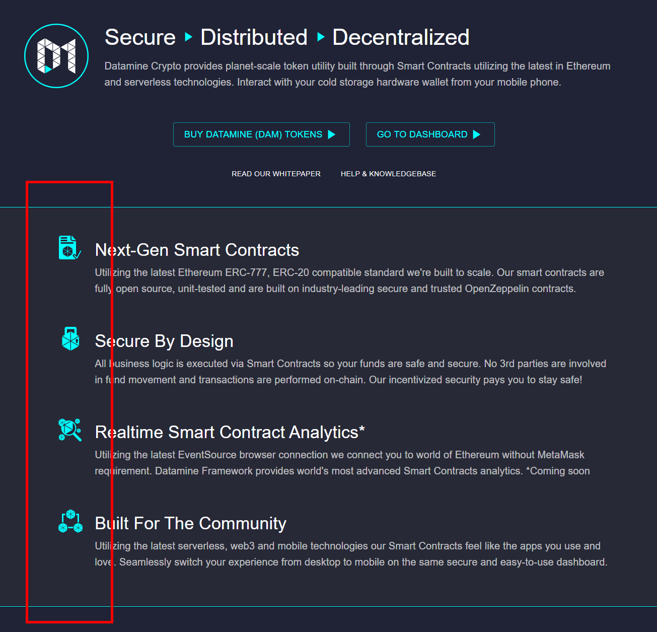
New Custom made svgs added for better illustrations
Frequently Asked Questions
Why did Datamine introduce custom SVGs to the dashboard?
The new custom SVG illustrations are designed to enhance visual clarity and UI/UX readability, allowing users to easily understand complex on-chain metrics and token interactions within our decentralized monetary system.
Which tokens are featured on the Datamine dashboard?
The dashboard displays real-time data for the entire ecosystem, consisting of DAM, FLUX, ArbiFLUX, and LOCK.
How do visual updates benefit validators and liquidity providers?
Clearer visual representations help validators and LPs quickly monitor critical indicators such as unminted balances, gas-to-reward ratios, and market efficiency, enabling faster and more informed strategic decisions.
 · hodlforjesus · #dev-updates