
New Interactive Metrics Chart Tracks FLUX Liquidity Migration
💡 AI Article Summary
Interactive Dashboard Enhancements
The Datamine Network has released new interactive widgets on the Market Metrics page. These updates provide real-time, on-chain data visualization to help users monitor the health and distribution of ecosystem assets across multiple chains.
FLUX Liquidity Migrates to Arbitrum L2
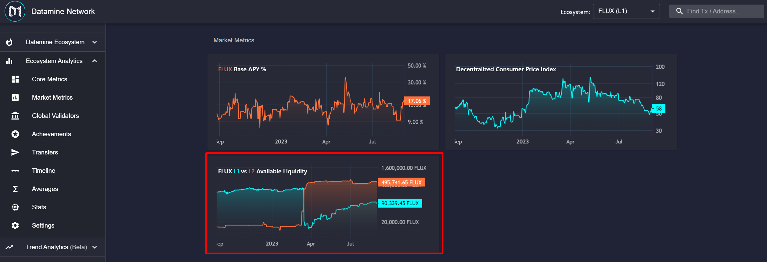
A key highlight of the update is the new FLUX Layer 1 (L1) vs. Arbitrum Layer 2 (L2) Available Liquidity Metric. This interactive chart tracks the movement of FLUX liquidity from Ethereum to Arbitrum.
Data from the chart reveals a significant migration of liquidity to Arbitrum, with L2 available liquidity growing by over 50%. This shift highlights the growing adoption of Layer 2 solutions within the Datamine ecosystem, where users benefit from significantly lower gas fees and faster transaction speeds compared to Layer 1.
🔥We've been working on some brand new interactive widgets for Market Metrics page!
Check out the new  FLUX L1 vs Arbitrum L2 Available Liquidity Metric.
With new chart you can see migration of FLUX liquidity to arbitrum in April and grew by >50%!👀
https://t.co/EsnZs3DP0q https://t.co/4EyHoNOWHU
Frequently Asked Questions
What is the new FLUX L1 vs L2 liquidity metric?
It is an interactive chart on the Market Metrics page that tracks and compares available FLUX liquidity on Ethereum Layer 1 and Arbitrum Layer 2.
Why is FLUX liquidity migrating to Arbitrum?
Arbitrum Layer 2 offers significantly lower transaction costs and faster execution speeds, making it highly efficient for ecosystem activities.
How much did L2 FLUX liquidity grow?
Based on the new on-chain metrics, available FLUX liquidity on Arbitrum grew by over 50% during the measured period.

 · hodlforjesus · #social-updates