
New Minted FLUX Timeline Added to Datamine Analytics
💡 AI Article Summary
Datamine Network has deployed a new build for its real-time analytics dashboard, introducing a comprehensive Minted FLUX Timeline. Currently in alpha testing with over 70 users, the analytics platform continues to expand its feature set to provide transparent, on-chain data for the ecosystem.
Real-Time Timeline and Metrics
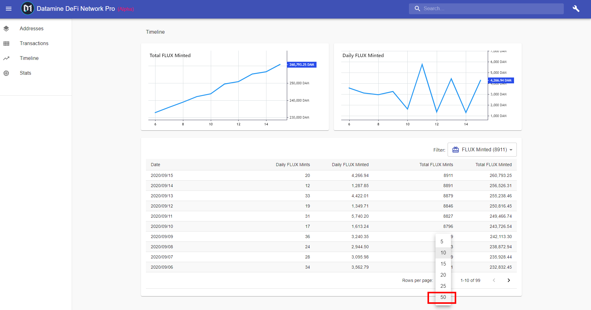
The newly added Minted FLUX Timeline offers critical on-chain metrics directly on the dashboard. Users can now monitor:
- Daily FLUX mints and daily FLUX minted volume.
- Total historical FLUX mints and total FLUX minted.
- Interactive charts displaying emission trends.
Additionally, the dashboard now supports an expanded view of 50 rows per page, with a 100-row option planned for a future release.
Burn Queue Tier Gating
To support the deflationary design of the Datamine ecosystem, advanced data options—such as the 50 and 100-row page views—will be gated behind a new Burn Queue tier system. Access to these expanded datasets is reserved for power users who actively burn FLUX, reinforcing the protocol's core utility loop where token destruction unlocks premium network features.
Next Steps
Development is shifting toward critical backend updates to enable database syncing. Future updates will also include address sorting improvements and a drill-down feature allowing users to click a single day to view its specific transaction breakdown.
Hey guys,
Hoping you are enjoying our Alpha progress on our realtime analytics from . Today I've put up another build with a whole new "Minted FLUX" Timeline. This comes with a whole slew of realtime information that you will find useful including daily FLUX mints, Daily FLUX minted, Total FLUX Mints, Total FLUX minted as well as some charts.
There is also now an expanded 50 rows per page option. In fact there will be 100 rows per page option in the future, however both 50 and 100 rows options will be gated behind "Burn Queue" tier system. These are advanced features and obtaining larger quantities of data like this will only be available to power users that burned a lot of FLUX.
I will be jumping back onto some backend updates to enable syncing, the Alpha analytics is now in test by over 70 users and I feel like we've made fantastic progress in the past couple of months. There is so much data available!
Hoping you guys enjoy the new timeline updates and address sorting options from yesterday, these are pretty awesome. One thing that I find is missing from current timeline series is ability to click on a single day and get a breakdown of transactions only for that day. I will be working on this after enabling syncing. 🔥
Frequently Asked Questions
What is the Minted FLUX Timeline?
The Minted FLUX Timeline is a new feature in the Datamine alpha analytics dashboard that displays real-time on-chain metrics, including daily and historical FLUX mints, total FLUX minted, and visual trend charts.
What is the Burn Queue tier system?
The Burn Queue is a utility-gating system that rewards power users. Advanced features, such as expanded 50 and 100-row data views on the dashboard, are reserved for users who have burned a significant amount of FLUX tokens.
Who currently has access to the new analytics dashboard?
The real-time analytics dashboard is currently in its Alpha phase and is being tested by over 70 community members as the development team prepares backend syncing updates.
 · hodlforjesus · #dev-updates