New Interactive Validator Distribution Charts Coming to Datamine
💡 AI Article Summary
Enhancing On-Chain Data Visualization
The Datamine Network dashboard is getting an interactive upgrade designed to improve transparency across the decentralized monetary ecosystem. A new diagram is currently in development, offering users an alternative visual breakdown of global token output distribution.
Tracking Validator Output Shares
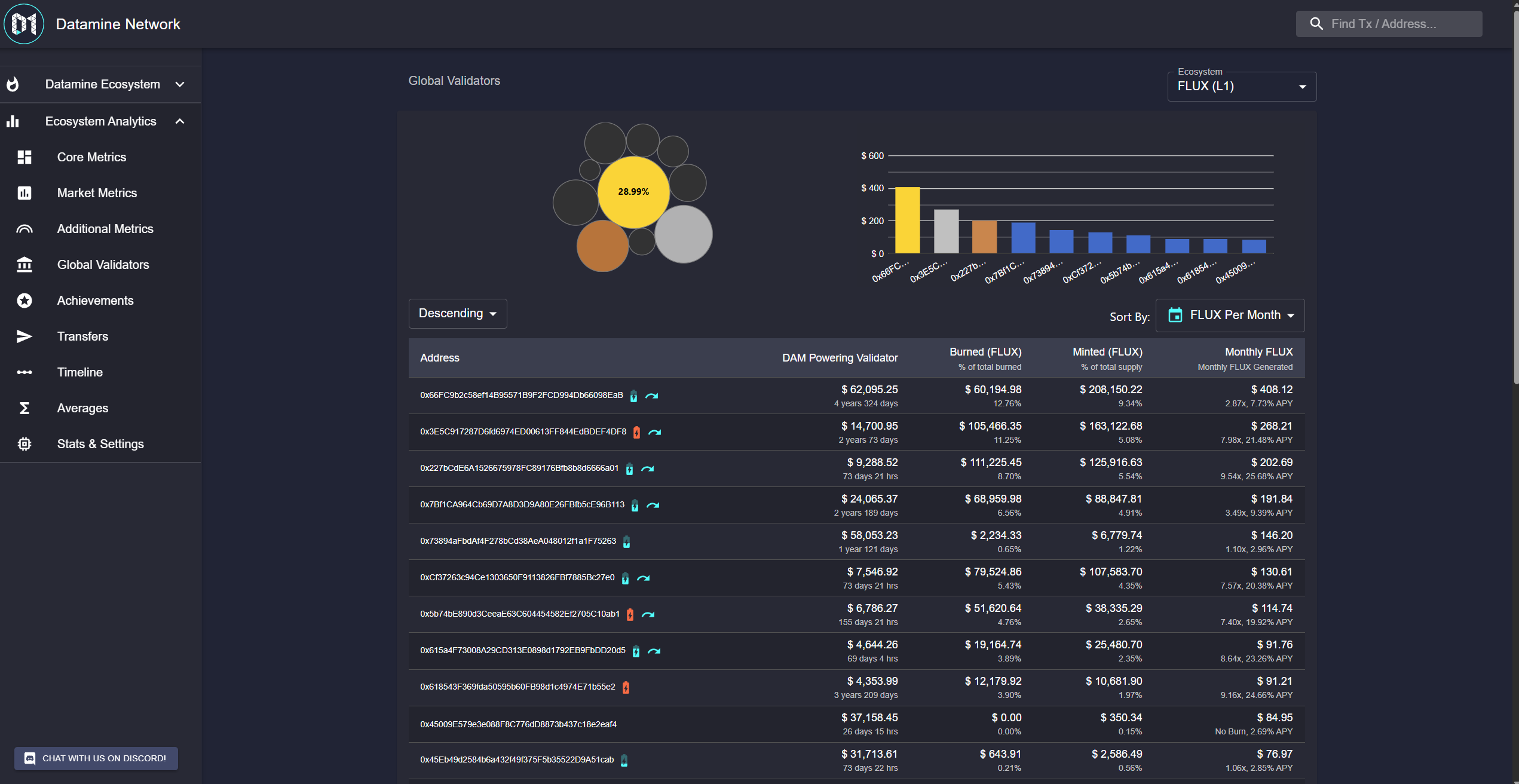
This upcoming analytical feature allows users to easily evaluate the distribution of minting power. By hovering over any of the top 10 validators on the network, users can instantly see the exact percentage of global output owned by that specific address. Currently a Work-In-Progress (WIP), this interface update is part of Datamine's ongoing commitment to providing clean, real-time, and immutable on-chain metrics for all participants.
Next update we'll add a new diagram for some pages. This is a different representation of who owns the global output You will be able to mouse over each top 10 validator and see how much % of global output they own.
Still WIP but it's almost there. I just thought it would be a cool way to visualize the data in a different way.
Frequently Asked Questions
What is the new global output diagram on Datamine?
It is an upcoming interactive chart on the Datamine dashboard that visualizes global token output, allowing users to hover over the top 10 validators to see what percentage of the network's output they own.
How do validators earn yield within the Datamine Network?
Validators generate yield by locking tokens, such as locking DAM on Layer 1 to mint FLUX, or locking ArbiFLUX on Layer 2 to mint LOCK. Burning tokens further boosts their minting rewards.
Is there a central authority that manages the Datamine Network?
No. Datamine is a fully decentralized smart contract system with no owner, no company, and no DAO, relying entirely on immutable Ethereum and Arbitrum smart contracts.
 · hodlforjesus · #dev-updates