Datamine Network Optimizes Dashboard Layout for Realtime Analytics
💡 AI Article Summary
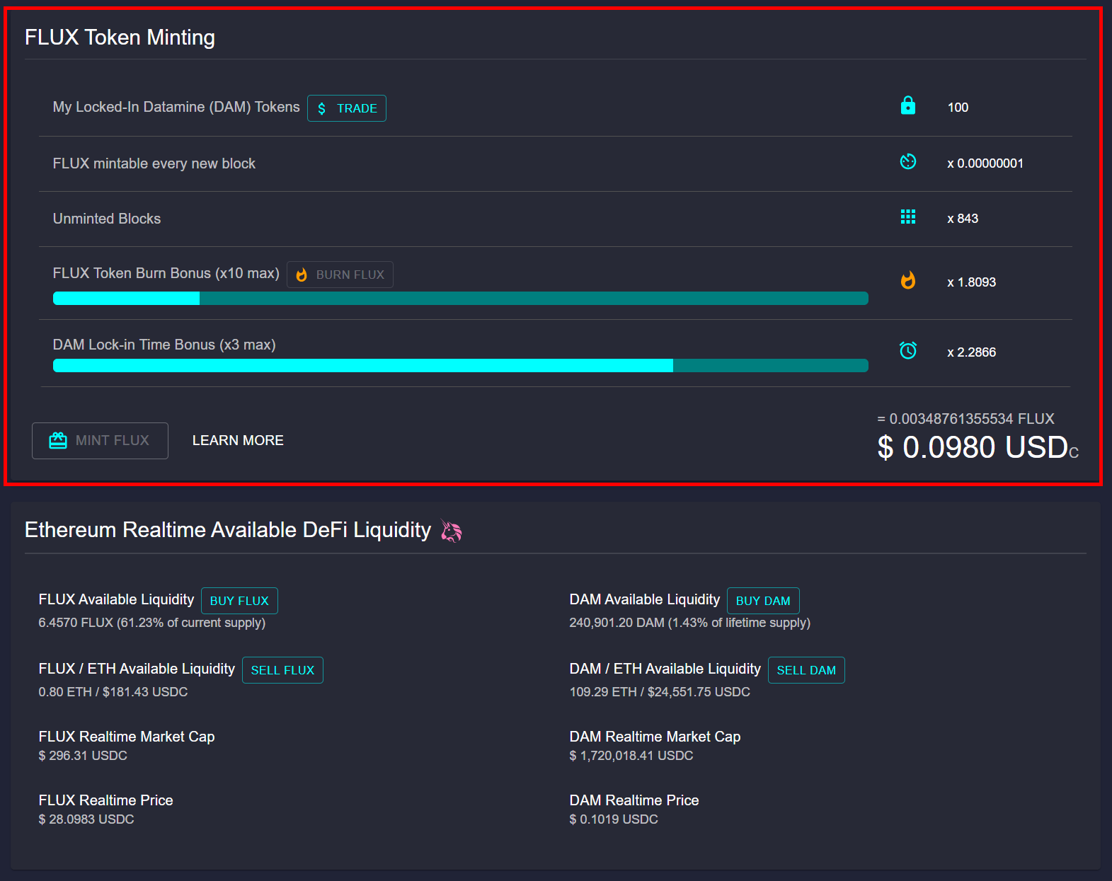
The Datamine Network has rolled out a user experience update to optimize the layout of its decentralized dashboard. The mint call-to-action (CTA) design has been refined to ensure that vital Realtime Analytics stay above the fold, providing an ideal viewing experience on standard 1080p monitors.
Improved Visual Hierarchy for Decentralized Data
With over five years of continuous uptime, the Datamine ecosystem operates entirely on decentralized smart contracts. Because the system has no central authority or company, transparent on-chain data is paramount. Community members rely on real-time metrics to monitor supply changes, token burn percentages, and liquidity pools.
This layout adjustment prevents critical analytics charts from dropping below the fold. Users can now view high-priority performance metrics alongside their active minting and staking widgets without needing to scroll.
Seamless Dynamic Monitoring
The updated interface ensures that key indicators—such as available liquidity and token emission variables—are immediately visible. In the Datamine ecosystem, balancing inflation and deflation is essential. By offering clean visual layouts for token interactions (spanning DAM, FLUX, ArbiFLUX, and LOCK), validators and users can easily execute strategic actions like burning and minting with immediate feedback from the system's real-time trackers.
We've also updated the UX of the mint call to action to ensure the Realtime Analytics don't go below the fold so it fits nicely on a 1080p monitor.
Frequently Asked Questions
What is the recent UX update on the Datamine dashboard?
The mint call-to-action (CTA) layout has been updated so that critical Realtime Analytics charts remain visible above the fold on standard 1080p monitors, removing the need to scroll.
Why is above-the-fold visibility important for the Datamine dashboard?
The Datamine Network operates with zero centralized control. Users must actively track on-chain data, including inflation and burn metrics, to make informed decisions about minting and locking tokens. Keeping these analytics above the fold ensures immediate access to crucial data.
What tokens are monitored on the Datamine dashboard?
The dashboard displays real-time metrics for all four ecosystem tokens: DAM, FLUX, ArbiFLUX, and LOCK.
Are the analytics on the Datamine dashboard updated in real time?
Yes, all metrics on the dashboard are pulled directly on-chain, providing immutable, transparent, and real-time facts about the state of the smart contracts.
 · hodlforjesus · #dev-updates