
Datamine Network Enhances Interactive Charting with Y Axis Drag
💡 AI Article Summary
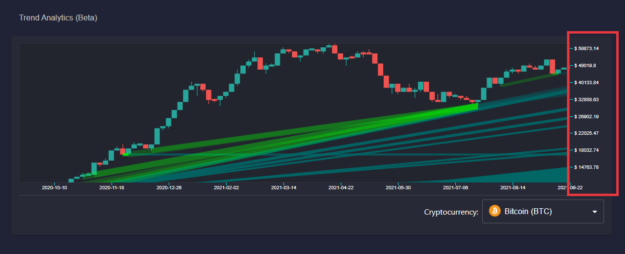
The Datamine Network has rolled out a front-end user experience (UX) update to its dashboard charts, introducing an intuitive Y-scale dragging feature similar to mainstream platforms like TradingView. This enhancement makes analyzing long-term tokenomics data and price trends far more accessible.
Enhancing Chart Navigation
Prior to this update, zooming into dense chronological data could prove difficult over long timeframes. The new update resolves this by pairing existing pan and X-axis zoom features with the newly implemented Y-axis dragging functionality. Users can now stretch or compress the vertical scale seamlessly, allowing for high-precision inspection of token charts, market capitalization movements, and supply metrics.
Upcoming Trends Filtering
Building on these navigation improvements, development is shifting focus toward interactive trends filtering. Major charts often display a high volume of minor fluctuations that can obscure macroeconomic patterns. Datamine is developing a granularity customization tool that will allow users to filter out smaller noise, focusing exclusively on the trends that matter. This calculated approach to UI design ensures the platform remains highly practical for daily decentralized financial analysis.
Hey guys,
Spent the day updating a bit of UX on the frontend. Now you can "Drag" the Y scale just like on tradingview chart.
This will be very helpful when zooming in closer to the trends as a long time frame is hard to see sometimes.
Now that we have both pan, X and Y zooms working I want to spend a couple of days working on interactive trends filtering.
With charts like Bitcoin there are simply too many small trends and the user will want to customize the granularity of what trends they want to see.
I am taking my time with this project as it requires just the right amount of UI & UX to be useful for everyday usage. So stay tuned there is lots more coming to Trends! 🔥
Frequently Asked Questions
How does the new Y-scale dragging feature work?
Similar to platforms like TradingView, you can now click and drag the vertical Y-axis of the Datamine dashboard charts to easily stretch or compress the scale for clearer trend visualization.
Why is interactive trends filtering being added?
Highly active assets generate many small fluctuations. Trends filtering will allow users to customize chart granularity, filtering out noise to focus on major movements.
What tokens make up the Datamine Network ecosystem?
The ecosystem consists of four utility-focused tokens: DAM (the foundation token), FLUX (Layer 1 utility), ArbiFLUX (Layer 2 efficiency), and LOCK (stability and permanent liquidity).
 · hodlforjesus · #dev-updates