
Datamine Network Adds Unique User Metrics to Dashboard
💡 AI Article Summary
The Datamine Network has rolled out a new round of dashboard optimizations focused on data transparency and user experience. Rather than rushing the deployment of a new transaction page, development has pivoted to enhancing existing interfaces with deeper analytical insights.
Expanded Real-Time Metrics
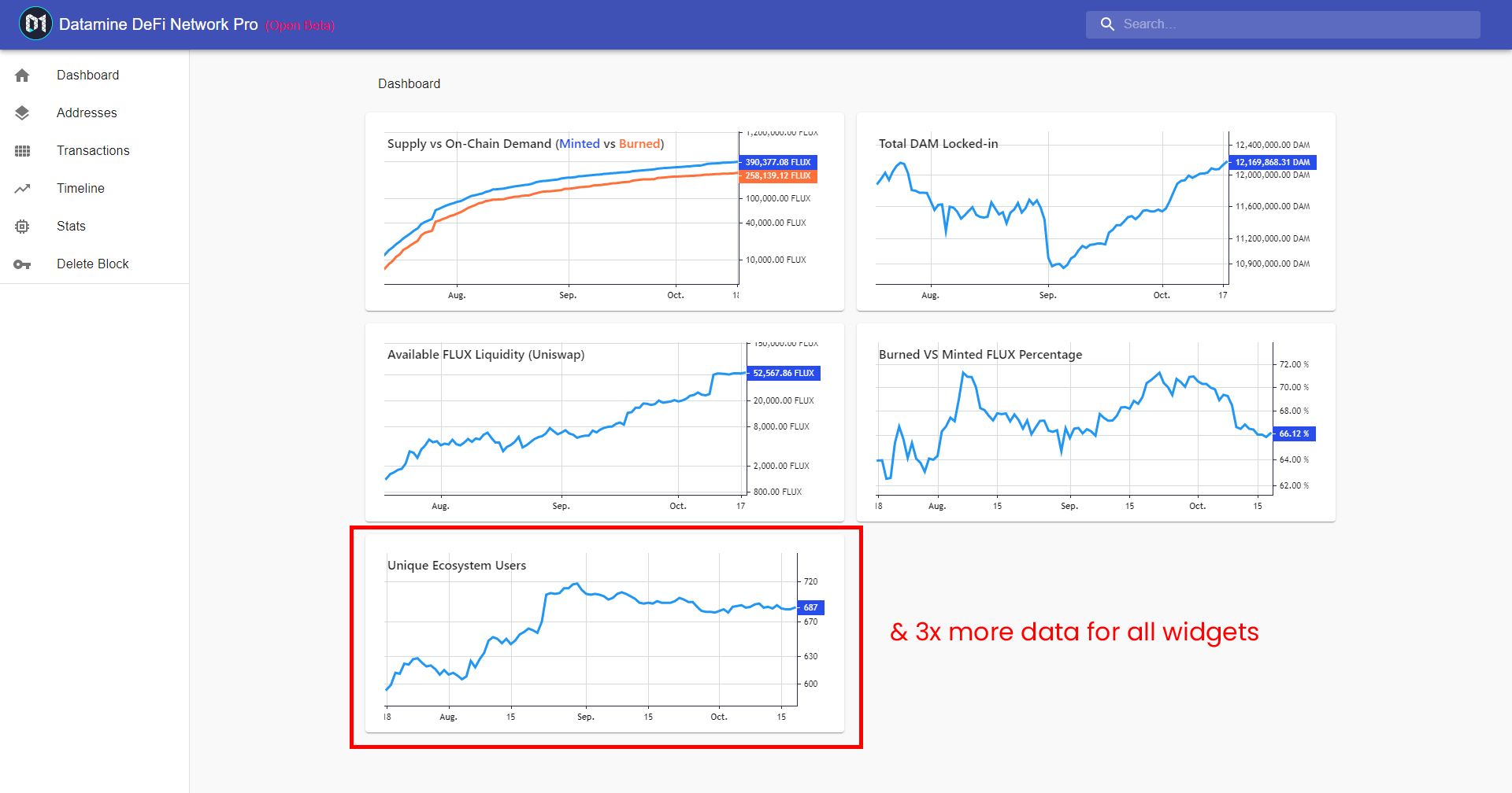
To give participants a clearer picture of ecosystem growth, a new core metric—Unique Ecosystem Users—has been integrated directly into the dashboard. Additionally, the historical data visualization has been expanded to a comprehensive three-month view. This longer window provides a more robust, real-time representation of key on-chain metrics, allowing users to track supply dynamics, burn rates, and overall network activity over time.
Personalized Address Timelines
Following this update, the next development phase will focus on upgrading the timeline page. The upcoming release will introduce per-address timelines and a redesigned single-page address view. Once active, this feature will generate localized charts and transaction histories for individual wallets, giving validators and liquidity providers a personalized, data-rich overview of their specific contributions to the Datamine ecosystem.
Hey guys,
Decided not to pursue the transactions page this round of updates and instead of focus on improving some of the existing pages (Mostly because I haven't picked a good UX for transactions page yet).
Instead I've added another core metric to the dashboard (Unique Ecosystem Users). I've also expanded the amount of data to 3 months so you will get a better realtime representation of all core metrics.
Next goal is to update timeline page to support per-address timelines and improving single page address view (as it currently needs work). Should be interesting week as the outcome will be per-address timeline and you'll end up with a bunch of charts for your address. 🔥
Frequently Asked Questions
What is the new metric added to the Datamine dashboard?
The latest update introduces the Unique Ecosystem Users metric, allowing community members to track active address participation directly on-chain.
How long is the historical data view on the updated dashboard?
The dashboard now displays up to three months of real-time historical data, offering a broader perspective on core ecosystem trends.
What features are planned for the upcoming timeline update?
The development roadmap includes per-address timelines and enhanced single-page address views, enabling users to generate personalized charts and transaction history for specific blockchain addresses.
 · hodlforjesus · #dev-updates